Unpack the hidden meanings of colour and how to apply them in web and graphic design.
Colour is one of the most powerful tools we have as designers and marketers. It doesn’t just look good; it drives emotion, creates meaning, and can even influence how people act. In Western culture, colours carry strong symbolic weight built from history, psychology, and cultural context. But when you take design global, those meanings often shift dramatically. Here’s a full look at colour psychology in the West, international insights, and the trending palettes and combos you’ll want to keep in your toolkit for 2025.
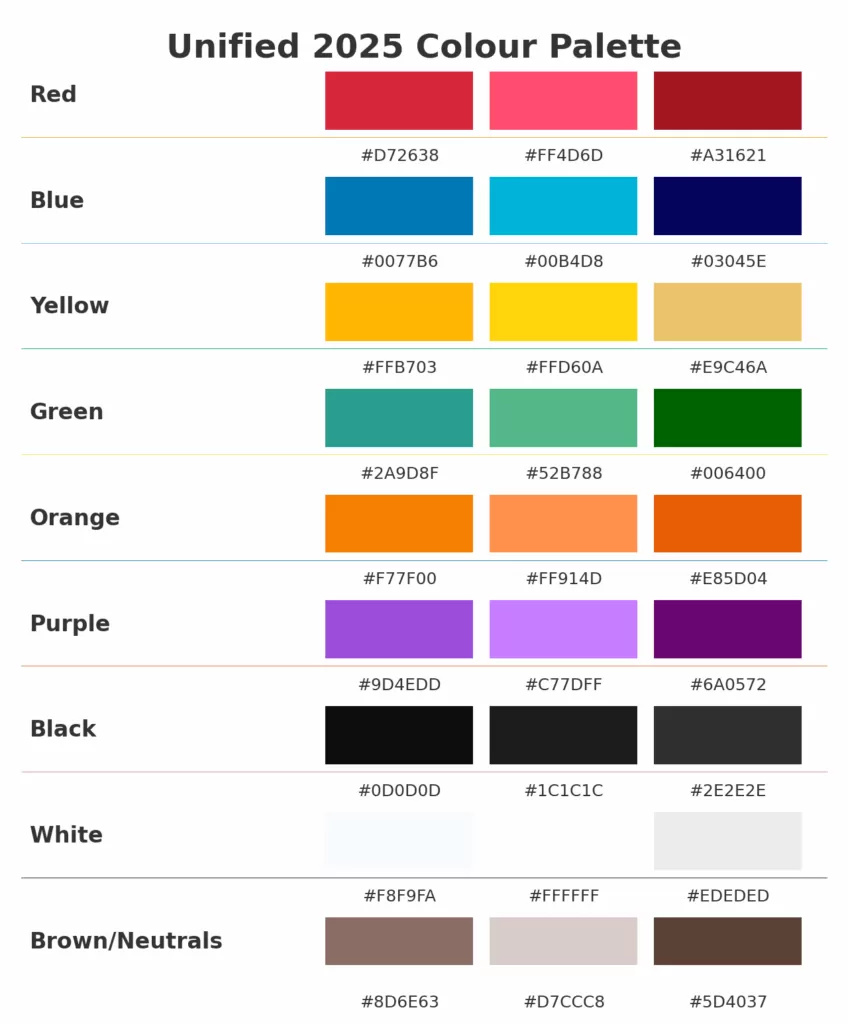
🔴 Red: Passion, Power, and Urgency
Red is a colour you can’t ignore. It’s biologically stimulating, raising the pulse and grabbing immediate attention. In the West, it’s the shade of passion, love, and romance—but also of warning, danger, and “stop right there.” Because it’s so strong, it can feel powerful and energizing, but it can just as easily overwhelm if you lean too hard into it.
International bonus: In China, red is lucky and joyous, used in weddings and New Year celebrations, while in South Africa it can symbolize mourning. In Latin America, it often represents passion, but in political contexts, it has strong ties to revolution.
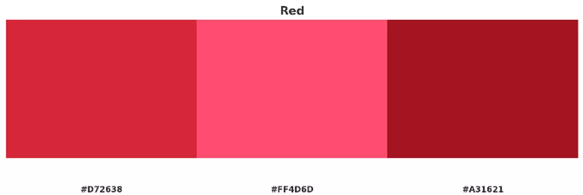
2025 trending reds:
- Crimson Energy
#D72638 - Bright Rose Heat
#FF4D6D - Blood Depth
#A31621
🔵 Blue: Trust, Depth, and Rationality
Blue is the great stabilizer in design. It’s calming, professional, and reliable—no surprise it dominates the corporate and tech world. It’s the colour of the sea and sky, representing depth and infinity, but it also has a flip side in Western culture as the colour of sadness and emotional distance. Still, when you want to project trust, authority, or calm intelligence, blue delivers every time.
International bonus: In Asia, blue often connects with immortality or spirituality. In Latin America, it’s tied to religion, especially the Virgin Mary. In parts of the Middle East, different shades of blue can represent protection and good fortune.
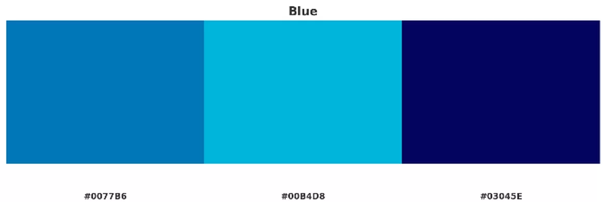
2025 trending blues:
- Ocean Depth
#0077B6 - Aqua Motion
#00B4D8 - Midnight Stability
#03045E
🟡 Yellow: Joy, Caution, and Creativity
Yellow is the spark of optimism in the colour wheel. It’s bright, cheerful, and eye-catching, which is why it’s so often used to draw attention. At the same time, yellow doubles as a warning colour in Western culture—caution signs, hazard tape, and road signals. Too much of it can be visually overwhelming, but in balance, it suggests creativity, energy, and fresh ideas.
International bonus: In Asia, yellow carries royal and noble associations, while in Latin America or Egypt it sometimes marks mourning. In Germany, it can be linked with jealousy or cowardice, showing just how much context matters.
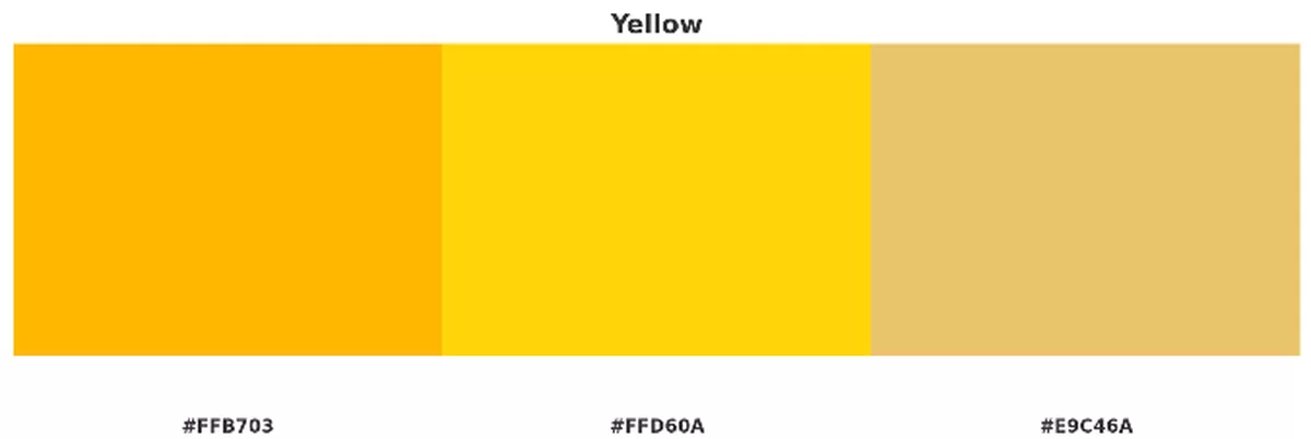
2025 trending yellows:
- Golden Spark
#FFB703 - Vibrant Alert
#FFD60A - Sandstone Warmth
#E9C46A
🟢 Green: Renewal, Balance, and Prosperity
Green is balance embodied. It’s the colour of nature, growth, and renewal—something deeply rooted in the Western psyche. At the same time, green is tied to wealth and prosperity, especially in North America where money is literally green. It’s one of the easiest colours on the eyes, creating a sense of calm and harmony that designers lean on to soften experiences.
International bonus: In Islamic cultures, green is sacred and positive. In China, though, a “green hat” implies infidelity—something you definitely want to avoid in branding. In some South American countries, green can symbolize death, reminding us again that context changes everything.
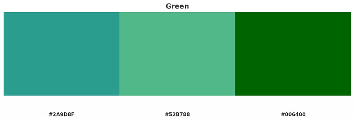
2025 trending greens:
- Teal Renewal
#2A9D8F - Fresh Mint
#52B788 - Dark Forest
#006400
🟠 Orange: Energy, Warmth, and Sociability
Orange is a firecracker. It’s energetic, playful, and social—less aggressive than red, but still powerful in its ability to grab attention. In Western culture, orange suggests fun, creativity, and excitement, making it a natural fit for youth-oriented or lifestyle brands. At the same time, it can sometimes feel too casual or cheap if not carefully balanced with other tones.
International bonus: In India, saffron orange is sacred and spiritual. In Japan, orange is linked with courage and happiness. Meanwhile, in parts of the Middle East, orange can carry more somber associations with loss.
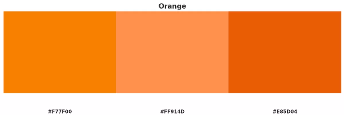
2025 trending oranges:
- Pumpkin Pulse
#F77F00 - Peach Glow
#FF914D - Fire Ember
#E85D04
🟣 Purple: Luxury, Mystery, and Creativity
Purple has always carried weight. Historically, purple dyes were rare and expensive, which is why the colour became synonymous with royalty and wealth. Psychologically, purple walks the line between imagination and spirituality, making it both mystical and creative. In design, it blends the energy of red with the calm of blue, giving it a dual nature that’s hard to ignore.
International bonus: In Japan, purple connects with aristocracy and refinement. In Brazil and other Latin cultures, purple often carries solemn or mourning associations. Used wisely, it can feel premium and powerful—but missteps can cheapen its effect.
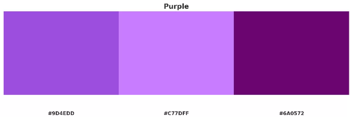
2025 trending purples:
- Royal Radiance
#9D4EDD - Neon Lavender
#C77DFF - Deep Violet
#6A0572
⚫ Black: Power, Elegance, and Mystery
Black is the classic of classics. In Western culture, it embodies power, authority, and sophistication—think tuxedos, luxury cars, and high-end branding. But it also carries a darker edge, representing death, grief, and the unknown. In design, black works best when balanced: too much of it can feel heavy or oppressive, but when used well, it radiates elegance and timeless appeal.
International bonus: In Egypt, black symbolizes rebirth. Across many Eastern cultures, mourning is marked by white instead of black, creating an interesting reversal. In African contexts, black can signal both power and death depending on region.
2025 trending blacks:
- True Depth
#0D0D0D - Charcoal Steel
#1C1C1C - Graphite Matte
#2E2E2E
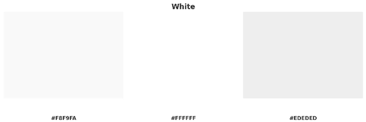
⚪ White: Purity, Minimalism, and New Beginnings
White is Western culture’s canvas for purity and simplicity. It’s the colour of weddings, minimalism, and clean design, representing clarity and fresh starts. But it’s not without its downsides: too much white space can feel sterile, clinical, or void of warmth. Used thoughtfully, though, it offers balance, breathing room, and timeless sophistication.
International bonus: In China, Japan, and Korea, white is the colour of mourning and funerals. In South Asia, it also appears in funerary contexts, but it can simultaneously symbolize spirituality and sacredness.
2025 trending whites:
- Cloud Mist
#F8F9FA - Absolute White
#FFFFFF - Pearl Veil
#EDEDED
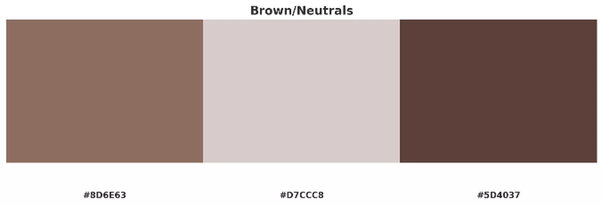
🟤 Brown & Neutrals: Stability, Earth, and Wholesomeness
Brown and neutral tones bring things back down to earth. They suggest grounding, reliability, and authenticity. In the West, browns and beiges are tied to nature and simplicity, often used to build trust and comfort. While some see them as dull or dated, they’re indispensable for creating balance and warmth in a design system.
International bonus: Across many cultures, brown represents the soil, sustenance, and humility. But it can also be seen as dirty or associated with mourning, depending on region. Designers can elevate neutrals by combining them with brighter accent colours to avoid flatness.
2025 trending neutrals:
- Earth Root
#8D6E63 - Sand Neutral
#D7CCC8 - Mocha Depth
#5D4037
Overarching Psychological & Design Principles
Contrast matters enormously: colour perception depends heavily on what colours it’s next to. Light/dark contrast affects readability. Hue contrast affects emotional tone.
Shade / tint / saturation are as important as the base hue. A muted red feels different than vivid red; a pastel yellow evokes calm vs neon yellow which shocks.
Cultural framing & context: what colour means depends on local culture, context, metaphorical language, religion, history. Always check for unintended negative meaning when crossing borders.
Brand consistency: consistency in colour usage builds recognition, emotion. But be flexible enough for local preferences in international designs.
Accessibility: for web/graphic design, ensure colour contrast, consider color-vision deficiency, avoid relying solely on colour to convey critical info.
International Bonus Tips: Applying Colour Design Globally
Do user research / A/B testing in target markets to see how colour picks land.
Be aware of idioms or phrases: e.g. “green hat” idiom in China.
Consider local symbols (flag colours, religious colours) that might shift perception.
Local festivals / cultural events often use specific colour palettes (e.g. red / gold in Chinese New Year; saffron in India).
Be sensitive to printing constraints or colour reproduction in non-digital media (e.g. pigment quality in some regions might shift colours).
Colour Combination Trends for 2025 in Web & Graphic Design
Below are some colour combo trends emerging (or likely to emerge more strongly) for 2025, with their aesthetic uses, advantages, and examples of how they might be leveraged.
| Trend / Combo Style | Typical Colours & Pairings | Why It Works / What It Conveys | Where It Might Be Best Used |
|---|---|---|---|
| Rich Jewel & Metallic Accents | Deep emerald green, sapphire blue, royal purple + gold or brass accents | Luxury, depth, prestige, craftsmanship; resonates with consumers wanting high quality, artisanal feel | Luxury goods, fashion, premium branding, packaging, high-end web design |
| Muted Earth + Warm Neutrals | Terracotta, clay, sand, olive, stone greys + cream / off-white | Natural, sustainable, wholesome; comfort; relaxed elegance | Wellness brands, environmental / eco design, interiors, slow fashion |
| Soft Pastel Gradients with Pops | Pastel base (mint, lilac, peach) + bright accent (pomegranate, citrus yellow, coral) | Modern, fresh, youthful; balance between calm and energy; good for digital interfaces, apps, social media | Startups, lifestyle brands, SaaS UI, mobile app design |
| Dark Mode with Vibrant Neon / Electric Accents | Charcoal / near-black + electric blue, neon pink, bright aqua | High contrast, futuristic, techy, bold; trend with dark mode UIs; eye-catching | Tech products, gaming, music / entertainment, nightlife branding |
| Monochrome + One Colour Pop | Grayscale (black, white, grey) + single bright accent (e.g. fiery red, electric orange, neon green) | Minimal yet striking; ensures clarity; accent draws attention | Web design, e-commerce, portfolios, spotlighting product / CTA |
| Analogous Warm Gradients | Using colours next to each other on colour wheel: e.g. red → orange → yellow, or blue → teal → green | Smooth transitions, visually pleasing, cohesion; warm gradients feel inviting; cool ones feel calm or techy | Backgrounds, hero images, brand identity refreshes, illustration work |
Sources
Here are sources used; useful for further reading:
“How Color Is Perceived by Different Cultures”, Eriksen. https://eriksen.com/marketing/color_culture/
- “Visual Color Symbolism Chart by Culture”, ThoughtCo. https://www.thoughtco.com/visual-color-symbolism-chart-by-culture-4062177
- “Color Psychology and Culture: Designing for a Global Audience”, DesignCrowd Blog. https://blog.designcrowd.com/article/2179/color-psychology-and-culture-designing-for-a-global-audience
- “Color Symbolism: The Complete Design Guide”, CareerFoundry. https://careerfoundry.com/en/blog/ux-design/color-symbolism/
- “International Color Guide: Cultural Associations”, Xerox Small Business Tips. https://www.xerox.com/en-us/small-business/tips/color-guide